Connecting You North
Kitikmeot Corporation is an Inuit-owned company that connects businesses to the North and provides new growth opportunities in the Kitikmeot region of Nunavut. After over 30 years of business, Kitikmeot Corp to ready to refresh and modernize the brand and build equity.
Agency: KEEN Creative
Kitikmeot Corporation
The Task
The company sought to gain new partnerships by refreshing and modernizing its brand messaging and visuals to communicate its value and market positioning. The desire was to show a connection to the culture using traditional ties in the brand’s identity while keeping it familiar to the past design elements, while modernizing the look for today.
As the design lead, the goal was to refresh the original visual identity and create a new brand look and feel that represents the Northern Canadian community while emphasizing the unique business opportunities Kitikmeot Corp and the region offer. After a brand audit was conducted, the information was taken back to create a design concept fitting their goals of community, opportunity and growth.
The Logo
The previous logo depicted 2 Muskoxen, a familiar animal to the region, representing community, strength and Arctic grit. To modernize the mark, I looked at ways to have the symbol show strength and opportunity, all-the-while staying true to tradition and culture. The tilt of the Muskox was made to represent the future and new opportunities.
The result was a modernized symbol of the region, using a contemporary, earthy palette. The typography used evoked a feeling of tradition and heritage while using the symbols of the regional language to tie in the roots.
Eskers, hill-like land formations seen in Nunavut were called upon to round out the brand’s look and feel and used as details in many collateral and digital applications.
The Website
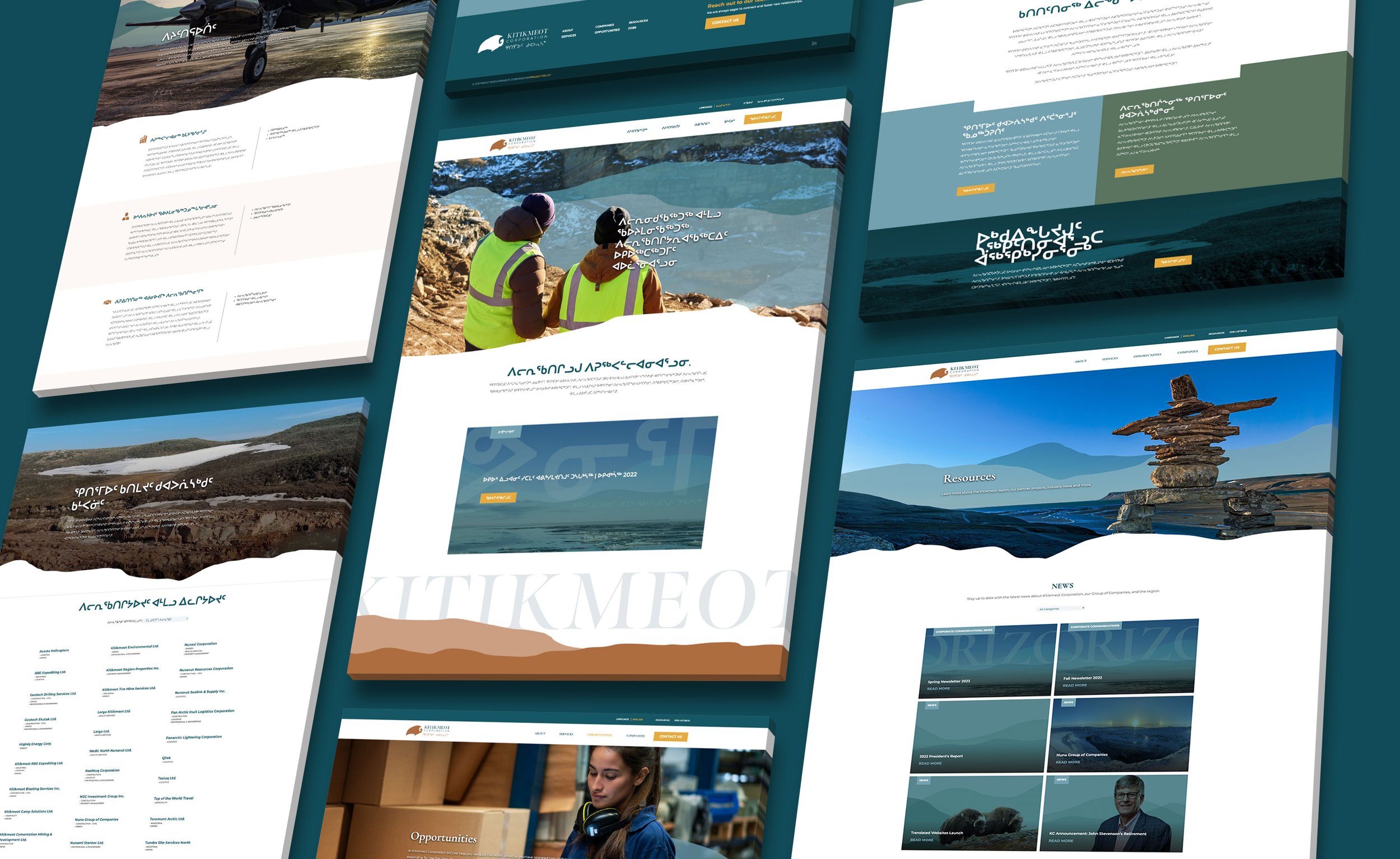
I redesigned the website to give Kitikmeot Corp a contemporary online presence. I aimed to showcase the allure of the landscape and underscore the opportunities businesses can derive from association with Kitikmeot Corp. through a fresh layout, aimed at conveying who KC is and what partnerships with them look like.
The website also has three language views, English, Inuinnaqtun, and Inuktitut, to be inclusive of the people of the Kitikmeot region. This was a design challenge as I was given the translated text after the English text had been laid out. Not knowing how much space was need for each language was tricky, but it all came together!
186% increase in direct website traffic
80% increase in total website sessions
56% increase in LinkedIn followers


